Introduction
STMO is shorthand for
sql.telemetry.mozilla.org, an installation
of the excellent Re:dash data analysis and dashboarding
tool that has been customized and configured for use with a number of the
Firefox organization's data sets. As the name and URL imply, effective use of
this tool requires familiarity with the
SQL query language, with which all of the
tool's data extraction and analysis are performed.
Concepts
There are three building block from which analyses in STMO are constructed: queries, visualizations, and dashboards.
Queries
STMO's basic unit of analysis is the query. A query is a block of SQL code that
extracts and (optionally) transforms data from a single data source. Queries
can vary widely in complexity. Some queries are trivial one liners
(e.g. SELECT * FROM tablename LIMIT 10), while others are many pages long,
small programs in their own right.
The raw output from a query is tabular data, where each row is one set of return values for the query's output columns. A query can be run manually or it can be specified to have a refresh schedule, where it will execute automatically after a specified interval of time.
Visualizations
Tabular data is great, but rarely is a grid of values the best way to make sense of your data. Each query can be associated with multiple visualizations, each visualization rendering the extracted data in some more useful format. There are many visualization types, including charts (line, bar, area, pie, etc.), counters, maps, pivot tables, and more. Each visualization type provides a set of configuration parameters that allow you to specify how to map from the raw query output to the desired visualization. Some visualization types make demands of the query output; a map visualization requires each row to contain a longitude value and a latitude value, for instance.
Dashboards
A dashboard is a collection of visualizations, combined into a single visual presentation for convenient perusal. A dashboard is decoupled from any particular queries. While it is possible to include multiple visualizations from a single query in one dashboard, it is not required; users can add any visualizations they can access to the dashboards they create.
Data Sources
SQL provides the ability to extract and manipulate the data, but you won't get very far without having some familiarity with what data is actually available, and how that data is structured. Each query in STMO is associated with exactly one data source, and you have to know ahead of time which data source contains the information that you need. One of the most commonly used data sources is called Athena (referring to Amazon's Athena query service, on which it is built), which contains most of the data that is obtained from telemetry pings received from Firefox clients. The Athena source is slowly replacing the Presto data source. Presto contains all of the data that's exposed via Athena and more, but returns query results much more slowly.
Other available data sources include Crash DB, Tiles, Sync Stats, Push,
Test Pilot, ATMO, and even a Re:dash metadata which connects to STMO's
own Re:dash database. You can learn more about the available data sets and how
to find the one that's right for you on the Choosing a
dataset page. If you have data set
questions, or would like to know if specific data is or can be made available
in STMO, please inquire in the #datapipeline or #datatools channels on
irc.mozilla.org.
Creating an Example Dashboard
The rest of this document will take you through the process of creating a simple dashboard using STMO.
Creating A Query
We start by creating a query. Our first query will count the number of client ids that we have coming from each country, for the top N countries. Clicking on the 'New Query' button near the top left of the site will bring you to the query editing page:
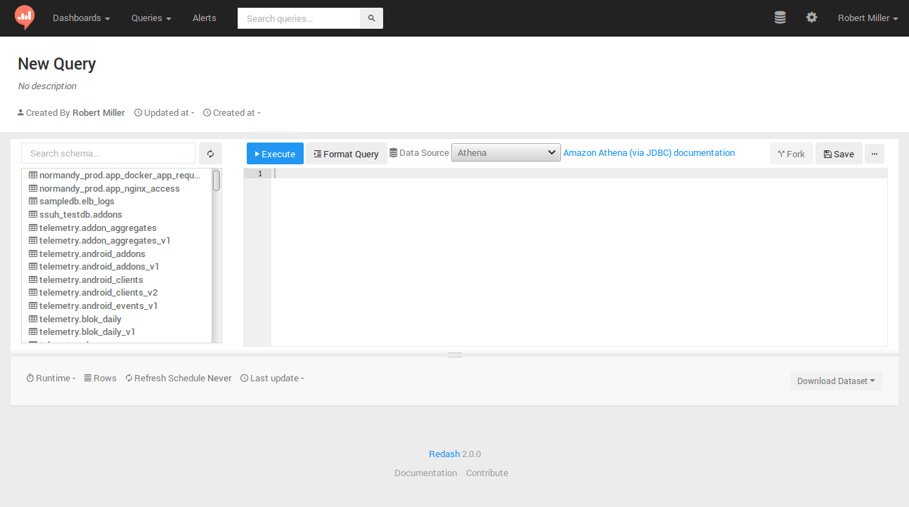
For this (and most queries where we're counting distinct client IDs) we'll want
to use the client_count_daily data
set that is generated from
Firefox telemetry pings.
-
Check if the data set is in Athena
As mentioned above, Athena is faster than Presto, but not all data sets are yet available in Athena. We can check to see if the one we want is available in the by typing
client_count_dailyinto the "Search schema..." search box above the schema browser interface to the left of the main query edit box. As of this writing, alas, there are no matches forclient_count_daily, which means this data set is not available in Athena. -
Verify the data set exists in Presto
It's not in Athena, so now we should check to see if it's in Presto. If you click on the 'Data Source' drop-down and change the selection from 'Athena' to 'Presto' (with
client_count_dailystill populating the filter input), you should see that there is, in fact, aclient_count_dailydata set (showing up asdefault.client_count_daily), as well as versionedclient_count_dailydata sets (showing up asdefault.client_count_daily_v<VERSION>). -
Introspect the available columns
Clicking on the
default.client_count_dailyin the schema browser exposes the columns that are available in the data set. Two of the columns are of interest to us for this query:country(for obvious reasons) andhll.
The hll column bears some explanation. hll stands for
HyperLogLog, a sophisticated
algorithm that allows for the counting of extremely high numbers of items,
sacrificing a small amount of accuracy in exchange for using much less memory
than a simple counting structure. The client_count_daily data set uses the hll
column for all of its counting functionality. Converting the hll value back
to a regular numeric value requires the use of the following magic SQL
incantation:
cardinality(merge(cast(hll as HLL)))
So a query that extracts all of the unique country values and the count for each one, sorted from highest count to lowest count looks like this:
SELECT country,
       cardinality(merge(cast(hll AS HLL))) AS client_count
FROM client_count_daily
GROUP BY 1
ORDER BY 2 DESC
If you type that into the main query edit box and then click on the "Execute" button, you should see a blue bar appear below the edit box containing the text "Executing query..." followed by a timer indicating how long the query has been running. After a reasonable (for some definition of "reasonable", usually about one to two minutes) amount of time the query should complete, resulting in a table showing a client count value for each country. Congratulations, you've just created and run your first STMO query!
Now would be a good time to click on the large "New Query" text near the top of
the page; it should turn into an edit box, allowing you to rename the
query. For this exercise, you should use a unique prefix (such as your name)
for your query name, so it will be easy to find your query later; I used
rmiller:Top Countries.
Creating A Visualization
Now that the query is created, we'll want to provide a simple
visualization. The table with results from the first query execution should be
showing up underneath the query edit box. Next to the TABLE heading should be
another heading entitled +NEW VISUALIZATION.

Clicking on the +NEW VISUALIZATION link should bring you to the
"Visualization Editor" screen, where you can specify a visualization name ("Top
Countries bar chart"), a chart type ("Bar"), an x-axis column (country), and
a y-axis column (client_count).:
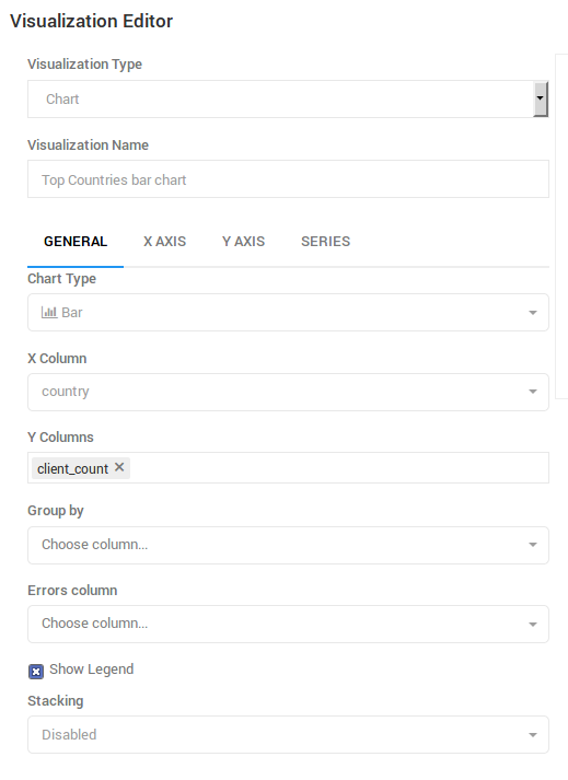
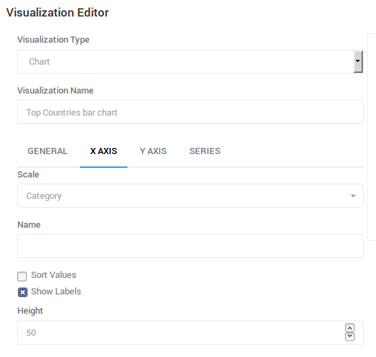
After the GENERAL settings have been specified, we'll want to tweak a few
more settings on the X AXIS tab. You'll want to click on this tab and then
change the 'Scale' setting to 'Category', and un-check the 'Sort Values'
check-box to allow the query's sort order to take precedence:
A Note About Limits
Once you save the visualization settings and return to the query source page,
you should have a nice bar graph near the bottom of the page. You may notice,
however, that the graph has quite a long tail. Rather than seeing all of
the countries, it might be nicer to only see the top 20. We can do this by adding
a LIMIT clause to the end of our query:
SELECT country, cardinality(merge(cast(hll AS HLL))) AS client_count FROM client_count_daily GROUP BY 1 ORDER BY 2 DESC LIMIT 20
If you edit the query to add a limit clause and again hit the 'Execute' button, you should get a new bar graph that only shows the 20 countries with the highest number of unique clients. In this case, the full data set has approximately 250 return values, and so limiting the result count improves readability. In other cases, however, an unlimited query might return thousands or even millions of rows. When those queries are run, readability is not the only problem; queries that return millions of rows can tax the system, failing to return the desired results, and negatively impacting the performance of all of the other users of the system. Thus, a very important warning:
ALL QUERIES SHOULD INCLUDE A "LIMIT" STATEMENT BY DEFAULT!
You should be in the habit of adding a "LIMIT 100" clause to the end of all new queries, to prevent your query from returning a gigantic data set that causes UI and performance problems. You may learn that the total result set is small enough that the limit is unnecessary, but unless you're certain that is the case specifying an explicit LIMIT helps prevent unnecessary issues.
Query Parameters
We got our chart under control by adding a "LIMIT 20" clause at the end. But what if we only want the top 10? Or maybe sometimes we want to see the top 30? We don't always know how many results our users will want. Is it possible to allow users to specify how many results they want to see?
As you've probably guessed, I wouldn't be asking that question if the answer wasn't "yes". STMO allows queries to accept user arguments by the use of double curly-braces around a variable name. So our query now becomes the following:
SELECT country, cardinality(merge(cast(hll AS HLL))) AS client_count FROM client_count_daily GROUP BY 1 ORDER BY 2 DESC LIMIT {{country_count}}
Once you replace the hard coded limit value with {{country_count}} you should
see an input field show up directly above the bar chart. If you enter a numeric
value into this input box and click on 'Execute' the query will run with the
specified limit. Clicking on the 'Save' button will then save the query, using
the entered parameter value as the default.
Creating A Dashboard
Now we can create a dashboard to display our visualization. Do this by clicking on the 'Dashboards' drop-down near the top left of the page, and then clicking the 'New Dashboard' option. Choose a name for your dashboard, and you will be brought to a mostly empty page. Clicking on the '...' button near the top right of the page will give you the option to 'Add Widget'. This displays the following dialog:
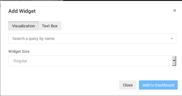
The "Search a query by name" field is where you can enter in the unique prefix used in your query name to find the query you created. This will not yet work, however, because your query isn't published. Publishing a query makes it show up in searches and on summary pages. Since this is only an exercise, we won't want to leave our query published, but it must be published briefly in order to add it to our dashboard. You can publish your query by returning to the query source page and clicking the "Publish" button near the top right of the screen.
Once your query is published, it should show up in the search results when you
type your unique prefix into the "Search a query by name" field on the "Add
Widget" dialog. When you select your query, a new "Choose Visualization"
drop-down will appear, allowing you to choose which of the query's
visualizations to use. Choose the bar chart you created and then click on the
"Add to Dashboard" button. Voila! Now your dashboard should have a bar chart,
and you should be able to edit the country_count value and click the refresh
button to change the number of countries that show up on the chart.
Completing the Dashboard
A dashboard with just one graph is a bit sad, so let's flesh it out by adding a handful of additional widgets. We're going to create three more queries, each with a very similar bar chart. The text of the queries will be provided here, but creating the queries and the visualizations and wiring them up to the dashboard will be left as an exercise to the user. The queries are as follows:
-
Top OSes (recommended
os_countvalue == 6)SELECT os, cardinality(merge(cast(hll AS HLL))) AS client_count FROM client_count_daily GROUP BY 1 ORDER BY 2 DESC LIMIT {{os_count}} -
Channel Counts
SELECT normalized_channel AS channel, cardinality(merge(cast(hll AS HLL))) AS client_count FROM client_count_daily GROUP BY 1 ORDER BY 2 DESC -
App Version Counts (recommended
app_version_count value== 20)SELECT app_name, app_version, cardinality(merge(cast(hll AS HLL))) AS client_count FROM client_count_daily GROUP BY 1, 2 ORDER BY 3 DESC LIMIT {{app_version_count}}
Creating bar charts for these queries and adding them to the original dashboard can result in a dashboard resembling this:
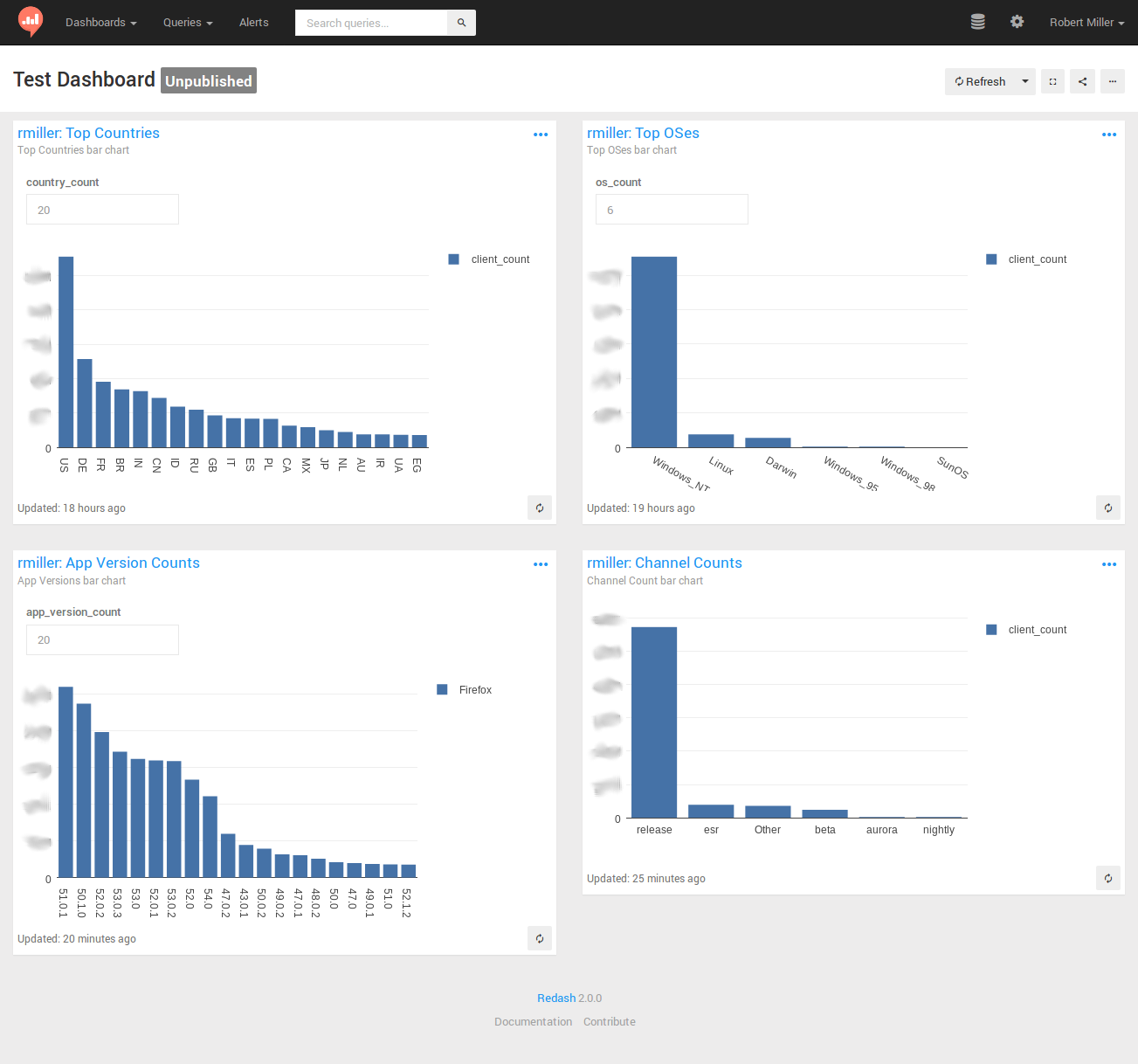
Some final notes to help you create your dashboards:
-
Don't forget that you'll need to publish each of your queries before you can add its visualizations to your dashboard.
-
Similarly, it's a good idea to un-publish any test queries after you've used them in a dashboard so as not to permanently pollute everyone's search results with your tests and experiments. Queries that are the result of actual work-related analysis should usually remain published, so others can see and learn from them.
-
The 'Firefox' label on the 'App Version counts' graph is related to the use of the 'Group by' visualization setting. I encourage you to experiment with the use of 'Group by' in your graphs to learn more about how this can be used.
-
This tutorial has only scratched the surface of the wide variety of very sophisticated visualizations supported by STMO. You can see a great many much more sophisticated queries and dashboards by browsing around and exploring the work that has been published by others.
-
The Re:dash help center is useful for further deep diving into Re:dash and all of its capabilities.
Prototyping Queries
Sometimes you want to start working on your query before the data is available. You can do this with most of the data sources by selecting a static test data set, then working with it as usual. You can also use this method to explore how a given SQL backend behaves.
Note that UNION ALL will retain duplicate rows while UNION will discard them.
Here are a couple of examples:
Simple three-column test dataset
WITH test AS (
 SELECT 1 AS client_id, 'foo' AS v1, 'bar' AS v2 UNION ALL
 SELECT 2 AS client_id, 'bla' AS v1, 'baz' AS v2 UNION ALL
 SELECT 3 AS client_id, 'bla' AS v1, 'bar' AS v2 UNION ALL
 SELECT 2 AS client_id, 'bla' AS v1, 'baz' AS v2 UNION ALL
 SELECT 3 AS client_id, 'bla' AS v1, 'bar' AS v2
)

SELECT * FROM test
Convert a semantic version string to a sortable array field
WITH foo AS (
 SELECT '1.0.1' AS v UNION
 SELECT '1.10.3' AS v UNION
 SELECT '1.0.2' AS v UNION
 SELECT '1.1' AS v UNION
 -- Doesn't work with these type of strings due to casting
 -- SELECT '1.3a1' AS v UNION
 SELECT '1.2.1' AS v
)

SELECT cast(split(v, '.') AS array<bigint>) FROM foo ORDER BY 1
How do boolean fields get parsed from strings?
WITH bar AS (
 SELECT '1' AS b UNION
 SELECT '0' UNION
 SELECT 't' UNION
 SELECT 'f' UNION
 SELECT 'true' UNION
 SELECT 'false' UNION
 SELECT 'turkey'
)
SELECT b, try(cast(b AS boolean)) from bar